Hello team Cultural Content
Following on from the previous post on cultural homepages, today I’m using a similar format to look at exhibition webpages.
I’ll be mainly looking at a scenario for a free, unticketed exhibition without a shop or membership scheme.
As before, skip to the end for the handy visual template for an exhibition detail page. Although, disclaimer, templates are inherently simplified and can’t bear in mind your individual context. There are definitely other ways to achieve the same thing.
What are the key things someone wants to know about a Museum exhibition?
Based on usability testing quite a few museum exhibition pages (and looking at the pattern of user journeys in analytics), we’ve found time and again, most folk want to know:
When it is
What it’s about (briefly)
Whether it has a cost
What they’ll see
Whether folk objectively think it’s any good (=press reviews)
More specialist and engaged audiences are also interested in;
Related exhibition events and/or publications
Links to collections online for specific exhibition objects
A link to the newsletter to sign up for email updates on more upcoming exhibitions
So, what might that translate to in terms of web content?
1. Intro module
In the previous post, we talked about ‘above the fold’ and ‘below the fold’. In web design, ‘above the fold’ is the content a user sees on a page without having to scroll. The purpose of the above the fold pageview is to encourage users to scroll on and find out more.
On an exhibition page I’d aim to have the following elements ideally visible above the fold:
A striking image.
The title of the exhibition.
Date and location.
Whether the exhibition is free or – if paid – what the cost is. If the cost is included in your general admission fee, state this. If it’s free, make that really clear. Otherwise, users tend to assume exhibitions are paid, and so may be unnecessarily put off.
If your exhibition is paid and ticketed, a big bold call to action to buy a ticket.
Ideally, I’d also have a subheading visible, or the first line of body copy text. The aim of this should be like a by-line, arousing interest and giving users a little more context on the exhibitions USP / core themes.
2. Opening para
Ideally the first line of this module would be visible ‘above the fold’ – peeking through into the design above. This allows users to start engaging with the keywords and thematic information about the exhibition even before they’ve scrolled.
The full module here should form 1-2 short paragraphs written for a non specialist audience. Bolded keywords can help users eyes skip to the important or pertinent details in paragraphs.
3. Images
In user testing it quickly becomes clear that website browsers are drawn to images, headings and formatted text.
This makes sense. Unlike with print media, you can’t read the internet cover to cover. So our habits to make sense of what’s on any given page have evolved; allowing us to get an overall sense of what a page contains and whether it’s relevant to our search intent. For something like an art exhibition, images are key to users’ perception of how attractive and relevant the physical show is. We frequently see users make more qualitative judgements of the exhibition based more on the images than the text content.
This module should then give users a good visual overview of what they’ll get in the exhibition. Captions should explain what the image shows. If it’s an image of an object in the museum collection, a hyperlink to the object record allows more engaged users to follow up with more detail. All images should have good Alt-Text to provide an equivalent experience for those on screen readers.
4. Reviews
We run a lot of Facebook Ads for cultural clients. One of the interesting data points you get from A/B testing different promotional copy is insight into what text is most likely to convert users (for example to buy a ticket). In our experience, ⭐⭐⭐⭐⭐ reviews almost always perform better than anything else (certainly for a similar character count).
In this design I’ve made a space for a single great review, and linked to more detailed press quotes below.
5. Exhibition detail
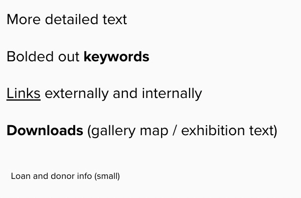
This should provide a little more detail than what went in to the opening paragraph. As before it should be mainly pitched a general public reader. In this space you can afford to introduce new concepts, so long as you explain or tie that back to overarching themes and relevance to a lay audience.
Bolded out keywords help users eyes fixate on elements of the text that are particularly important, and give them a quick sense of the content of the paragraph.
This is a good place to include links to other parts of your website and external website (which will also improve the SEO of this page).
It’s also a good place to add a link to a gallery map or, for example, a large-text version of the exhibition text.
A lot of museums put a large amount of lender and funder information and links in the same weight as this informational copy. This can confuse users in testing. Approaches like the Jewish Museum’s (New York) are quite elegant, where this information is included here but in smaller text, clearly delineating it from the show description.
6. Plan your visit and access
It’s useful to point users to the plan your visit page, so that they have the links right at hand if they want to go ahead and see this exhibition.
The exhibition page should contain a link to your access page and/or a description of any specific access provisions in place for your exhibition. It’s also helpful to provide the contact details of a specific member of staff users can contact for additional information.
7. Additional multimedia
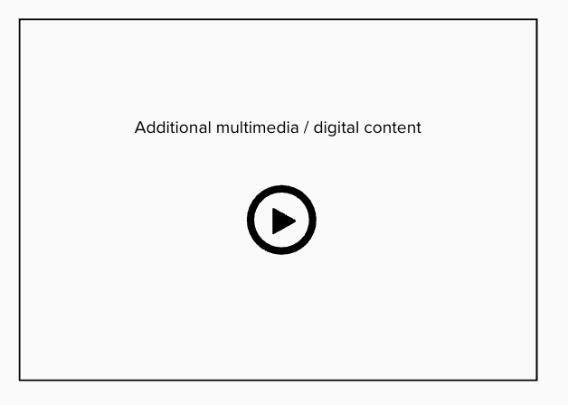
Most museums create some exhibition specific content: sometimes a video ‘trailer’, sometimes curator blogs. This is where I’d place that content. It’s sufficiently low down the page that you’re not cannibalising screen real estate from more transaction/core-information orientated visitors. At this point on the page it provides extra rich and contextual information for users who have a bit longer to browse.
8. Possible additional content
Possible additional content you might want to include on your exhibition page:
Any related exhibition events you have. Events should have a date and title visible and be ordered by date, and it’s nice if on a scroll you can reveal prices (or ‘free’ if they’re free) and any specific audience labels (e.g. family friendly).
I’ve added in a space here for additional reviews, but depending on the amount you have, this might not be necessary.
Any additional online content you might have. This might not apply in your case (or might be covered by the one featured piece of online content you’ve slotted in in (7), but essentially this grid is designed to house additional online content: for example virtual galleries, a pre-filtered link to all of the online collection.
9. Final calls to action
Lastly I’d add a call to action right at the bottom of the page, firstly to the newsletter sign up (but highlight in the body text that the newsletter will give you updates about upcoming exhibitions).
And finally I’d add a link either to your ticketing page or (in this case) to plan your visit. On a long page like this, it’s good to have a number of different call to actions to allow a visitor to convert. I’m mainly looking at a free, unticketed exhibition. For a ticketed exhibition, you’d want to have a number of links to ticketing throughout this page.
And that’s broadly it. This is very much a template, and depending on the size of your digital estate, there may well be lots of other things you could slot in (like shop product / membership upsells).
Exhibition page template
A few examples:
Jewish Museum New York: for an image carousel you instantly want to play with, clearly separated lender/funder copy from main exhib info, nicely formatted headline press quotes and a more detailed body of quotes further down, punchy opening sentence and formatted keywords in body copy to make the text easy to scan.
Met Museum: it’s easy to hold up the Met as a good example, but the one element of their interface I particularly like here is their use of anchor links at the top of this long page to quickly ping users down to the relevant part of the interface.
Fruitmarket gallery (Edinburgh) do a nice job on their exhibition page of leading with rich multimedia from the show, and have included an audio version of the exhibition text. Then they follow up with behind-the-scenes storytelling; interviews with the artist and biography of the artist. They end with related shop product.
If you’d like to talk more about web content: georgina@onefurther.com


