Hello team Cultural Content
Today I’m going to be talking about homepages. Specifically free-to-enter museum homepages; why people are on them and how to meet their needs.
The TL;DR version of this post? Skip to the end for a handy visual of my template of what a free-to-enter museum homepage should, at a minimum, contain.
Why users are on cultural organisation homepages
Based on running lots of user testing sessions (and having spent a fair amount of time analysing user journeys in Google Analytics), there are – broadly – three main types of users who might be on your homepage:
Users who know the organisation and what they want – these people make a bee-line for the menu
Users who know the organisation but don’t have a firm goal in mind, it may be they’ve found the information they came to the website for and are now browsing, or are a bit lost
Users who don't know very much about the organisation and (for whatever reason) want to find out more
This is a bit of a simplification but, in general, people who have a very specific goal in mind (#1 above) will likely use the navigation / site search and/or Google search to find what they’re after. Museum homepages are too different to be effectively used as a navigational tool. The purpose of the homepage is to meet more browseable/inspirational needs (types two and three here). That’s what we’re going to look at meeting below.
How to build a homepage to meet user needs
What a homepage is not:
a dumping group for content that won’t fit nicely elsewhere.
somewhere to highlight internal initiatives, strategic documents and business plans that are very important to you and your staff, but are not the reason the general public land on your website.
a good place for internal acronyms and jargon.
What a homepage is…
A cultural organisation homepage is like a storefront window display.
The job of a window display is to showcase the most attractive products in as welcoming, arresting and stimulating way as possible, whilst conveying a good sense of the overall tone and ‘feel’ of the store itself.
In this analogy website content is your ‘product’. Your homepage should showcase the most attractive web content in a way that encourages visitors to explore more, and inspires them to visit in person.
When I’m designing content for a new website launch, I do the homepage last. Just as:
you wouldn’t design your window display until you’ve worked out what products you’re stocking.
you wouldn’t write the Executive Summary of the report before you’ve written the report itself.
Likewise, the website homepage should draw from the most engaging content from across your site, cherrypicking content that provides entry-point answers to common questions, for example who are you? what do you do? what’s it to me?
Let’s have a little look at what that amounts to…
‘Above the fold’* view:
Arresting visual
Opening hours
Link to plan your visit
Below the fold
Punchy sentence explaining who you are
New things to see/do (typically exhibitions / events)
Browseable content (storytelling and or behind the scenes)
Other reasons to visit (things to eat, things to buy, things for kids/babies)
A potential conversion; donation, membership, or enews sign up
*‘Above the fold’ means the view of the webpage that you see before scrolling.
So, first up, what should a user see ‘above the fold’ when they first land on your homepage?
The primary point of the first view a user sees when they land on your homepage is to inspire them to scroll further down your webpage.
This might be an arresting drone footage video of your site and/or grounds. Although, all video should have a mobile fallback option that is a still image, as video can incur high data charges and make a webpage unduly laggy on mobile.
This might be an instantly recognisable, but beautiful shot of your entrance or interior.
…Or a shot of audiences in your space enjoying themselves, so long as it’s clear to an outsider where they are. And if you’re serious about diversifying audiences, avoid showing pictures of visitors that are only within a narrow demographic, as this can implicitly ‘other’ less traditional audiences.
Imagery should be updated from time to time and (if outside) seasonal.
Text should focus on providing a ‘welcome’ rather than your name – users will understand who you are from the logo in the top left.
If you’re a free to enter institution, state that clearly.
For organisations who don’t have a ‘permanent’ reason to visit (e.g. a gallery which is entirely filled with temporary exhibitions, or a performing arts venue), it makes sense to lead with the current main show.
This is a good place for a link to opening hours, or – better yet – a statement like ‘We’re open today. More hours »’ Here ‘more hours’ should reveal a full list of hours (users will likely be familiar with this behaviour from Google).
This is a good place for a button link to plan your visit. The visit page will likely be the most visited on your website, so a big, bright call to action button for users to quickly see where to click helps signpost the most common user journey from the homepage.
2. Who are you?
This module is often missed on cultural sector homepages.
Although you know what your organisation is (and probably why it’s important and why visitors enjoy it), this is not common knowledge. If someone lands on your website homepage for the first time thinking ‘who are these guys?’, is there anything there to tell them?
I’ve based this post on a single museum example, it’s more difficult to do this on a museum group homepage, but the same logic broadly applies – what are your individual museums and what do they collectively contribute to?
Conversations about ‘who we are’ can be difficult for any one person to write, and can hold up a web project. If I’m designing content for someone else, I generally try and start with some copy that’s already been approved elsewhere; a modified version of a Twitter or Instagram bio, or a nicely positioned contextual sentence in a membership brochure/ donation ask.
3. Reasons to visit now
This section should present the new and time-limited reasons to visit; typically current exhibitions and upcoming events.
All events and exhibitions should display the date range.
I’d also add any ⭐⭐⭐⭐⭐ reviews here. In our A/B testing of different show copy for cultural organisations’ social media ads, ⭐⭐⭐⭐⭐ reviews almost always perform better than anything else, so I’d add any of those you have in to the listing here too.
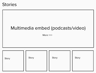
4. Browseable content (storytelling and or behind the scenes)
Almost all cultural organisations we work with are creating some kind of digital content; it might be a blog, a podcast or video series.
This module is designed to house some of that. It’s for a user who's broadly interested in your organisation but hasn’t been grabbed by any of the visit-related information above. It’s designed to provide more of a behind-the-scenes view of what goes on at the organisation, and what’s special about it.
The content here should also be refreshed regularly. This could happen dynamically if you’re pulling through the most recent article or podcast feed. If you have to update this section manually, it’s important to factoring those updates in to your editorial plan, along with social media and enews updates.
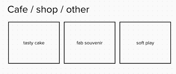
5. Other reasons to visit (things to eat, things to buy, things for kids/babies)
For many cultural venues, what I’m calling the ‘other reasons to visit’ will be as important to your visitors as your collection / mission driven programming. A glance at TripAdvisor tells you enough – people visit museums as social spaces. The cake, toilets, shop, and any facilities for children and babies are as much a part of the experience as the pedagogical content.
6. End of page; donation / membership / enews ask
As the last module on the page, I’d add a cause-led donation / membership ask. By emphasising the broader mission around what you do, you give audiences an emotionally richer understanding of why you exist and the social value you create.
Equally, it’s probably only worth linking to a donation page here if your donation payment page works well, you can quite easily kill all the goodwill you created around your mission if your donation form has lots of usability barriers in it.
I might steer away from using a donation or membership ask here if the module above (other reasons to visit) is heavily commercial (for example mainly advertising money you can spend at the venue in the shop / cafe, as opposed to free facilities). Having two modules focussed on ways visitors can spend at the bottom of the page might put audiences off, so I’d be aware of the balance.
If you wanted a different ‘conversion’ at the end of the page that requires no spend you could make this last module a newsletter sign up. In this instance, be clear about what the user will get from signing up (updates on events, notifications of sales in the shop / other).
Final words
The tone on your homepage is important. People who land here don’t want a Wikipedia entry. It’s easy to write for a staff audience (as we hear their feedback all the time). It’s more difficult to write for a visitor. That requires us to think about what they will need to know, or be excited by, at every point. But ultimately the homepage is for your visitors; potential ones and existing ones. Going the extra mile to establish how best to serve user needs is the work of creating good website content.
Homepage content template
Here’s a template of a good starting point for your homepage if you’re a free to enter museum or cultural organisation with a mix of a permanent collection and temporary programmes:
A few examples of Museums following this model (or near enough)
Whitney Museum of Art (Structure: headline exhibition > reasons to visit now > Browseable content)
Ashmolean Museum (Structure: Welcome / opening hours > ‘who we are’ > reasons to visit now > other reasons to visit > browseable content)
Hepworth Wakefield (Structure: Opening hours > headline exhibition > reasons to visit now > browseable content)
As always, drop me an email if you have thoughts/comments; georgina@onefurther.com 🎈
Have a great week.
Georgina


