

Cultural Content – New website? New content!
Cultural Content – New website? New content!
The DIY Discovery Series

Morning all,
Today I’m giving you a quick overview of the tools and processes I most commonly use in a website transformation process as a Content Strategist.
The overall structure of this piece is in three parts:
Content planning and research: 5 tasks I use to get more data on how well the existing site was performing for audiences
Planning and testing a new Information Architecture (IA) and site navigation
The documents I used to guide writing/sign off of the content: (a) content manuals or ‘playbooks’ to guide content writing in the first case, (b) a style guide to create consistency and best practice in web content writing going forwards, (c) a set of training sessions designed to up-skill staff across the organisation in topics like Search Engine Optimisation, writing for web and how to use Google Analytics.
Each subheading could be a post in its own right (any some may become them in time!) but here’s the full process, in a high level, start to finish.
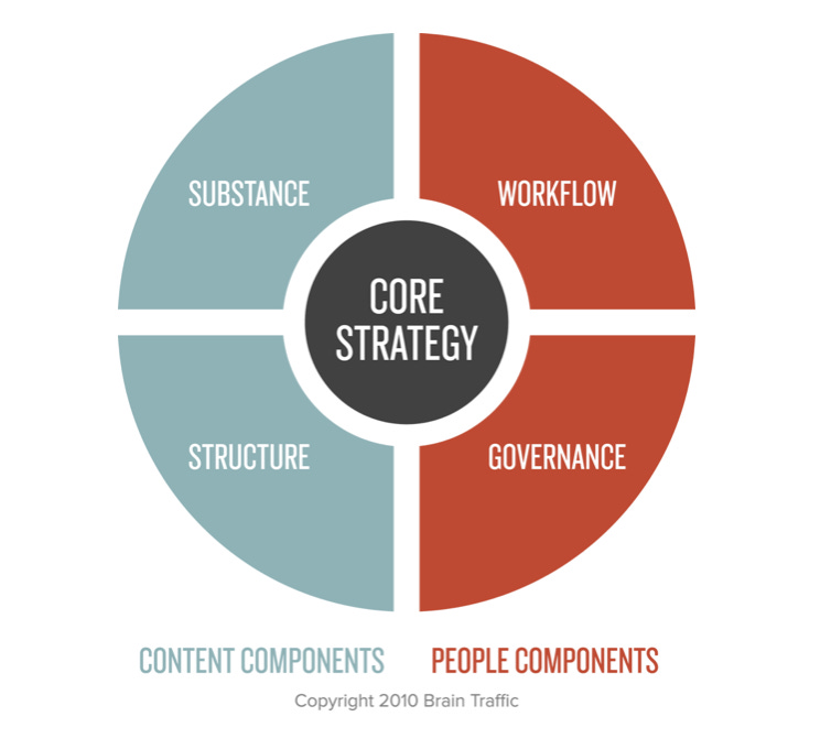
What I like about this visualisation is that typically when people think of content strategy they think of the content components: they think ‘what am I going to write?’ — the ‘substance’ of the text on the webpage; and ‘where am I going to put it?’ — the ‘structure’. But 50% of the success of your content is to do with how well you’ve thought about your people components.
If you want to make meaningful change to your content, particularly content that sits outside your area of expertise, you’re going to have to work with different teams and get them to frame their expertise in a way that is appropriate but also in keeping with the site tone, style and design as a whole. So I’m going to run through the tools and processes I’ve used for building up content and structure at the same time as creating buy-in, shared understanding and policies to allow for the ongoing evolution of content within the principles and research underpinning the strategy.
At the start of a web content redesign project you’re going to want to work out what’s working on your current site and what’s not working and why, this will help you focus the time you have to dedicate to the redesign. We’ll look at that in part I; User research.
1 – User research
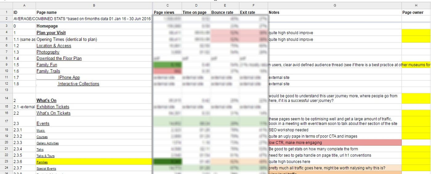
1.1 – Create a content audit
You can read all about these in last week’s post.
1.2 – Meeting with information owners / subject matter experts
How is it best to structure initial conversations with the information owners or subject matter experts in your organisation? You need the expertise in their heads but you also don’t want them to railroad pages and pages of unformatted text into your nice content design framework… Two points i) start with the data ii) understand where they’re coming from
Start with the data
Coming to interviews with information owners armed with a content audit is a good move.
It gives you the benefit of objective data to talk through some of the anomalies the audit has thrown up (e.g. great swathes of the section with low views / last updated historically)
This allows you to build more context around the authorship, original rationale, current purpose and viability of sections.
Often again there is some low-hanging fruit to be discovered here, in terms of taking offline out-of-date pages / pages that no longer have a purpose / answer a user need.
Understand more about where they’re coming from
It’s also a good opportunity to ask info owners:
How happy they are with their section of the website.
Any ambitions they’d like for the new website.
Their understanding of who the audience is, and any research they have on that.
What KPIs might be appropriate for it.
How content planning, creation, review and evaluation happens in their department – and whether this has changed within the time they’ve been at the organisations.
How workflow/governance works in their section (can they publish to live?)
1.3 – External audience interviews
Just as important, but often relatively neglected in big organisations, is talking to your external audience. I would tend to begin a project asking the organisation to segment different types of website users (typically academics, family members, community groups, subject specialists/ enthusiasts and teachers). More on segmentation and personas here.
When speaking to users you’re really trying to identify user needs for different user journeys on the website. We’ll talk more about user needs below but essentially you’re trying to identify:
The scenarios in which different kinds of users land on your website
What they’re after in that scenario; what do they need to do / feel in order to consider that web visit a success?
There are different ways you can go about identifying user needs from speaking to users. These include:
Usability testing the old site (more on usability testing as a process here) – this allows you to test how well your current site (or a prototype new site) performs in terms of delivering against defined user tasks. It’s helpful for incremental data-based changes, but if you’re looking to start from scratch it’s not going to tell you about pages that don’t currently exist.
You can conduct user interviews with different types of audience to understand more about the scenarios in which someone lands on your website, what they’re after at the time, what their pain points are. You can ask them what device they’d typically be on, what search terms they might use. You can ask them to show you how they’d do this on their device in the interview and see where they end up (it might be your site, but it might be a competitor’s). All of this helps build a picture of the context in which a user has a need which intersects with a service of a piece of content you provide.

When conducting user interviews it’s a good idea to have Henry Ford’s maxim in your head: ‘If I’d asked my customers what they’d wanted, they would have asked for a faster horse.’ It’s tempting to look to your audience for all the answers to guide your product development, but they are not experts in digital content / products, as you are. The point of this exercise is to understand the motivations behind their interaction with you, and the scenarios in which your museum overlaps with their life and aspirations. It’s then about translating that motivation and context into digital best practice. So in Henry Ford’s case that was about understanding the need for speed, efficiency, comfort — and then using his superior engineering understanding to devise a solution that could meet those needs more effectively than anyone had before him (or could be achieved on a horse 🐴).
1.4 – Formulating insights into user stories
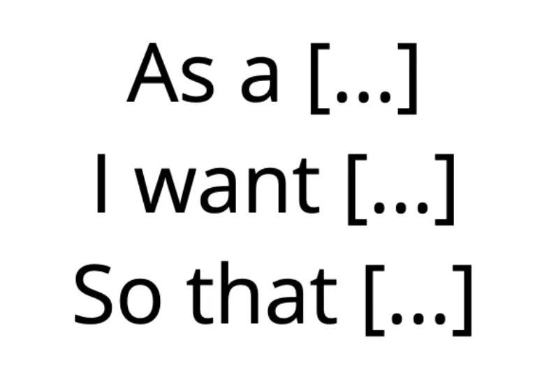
As you’re going about doing your interviews, you can start pulling out the scenarios in which your audiences land on your website as user stories. User stories are the building blocks for how you should go structuring your new web pages: they’re your nuggets of how [[what the museum offers]] intersects with [[your audiences’ interests]].
A user story is essentially a tripartite sentence in the form of:
As a…
I want….
So that…
For example;
As a [[busy mum]]
I want [[to find out what’s on nearby me in the next week]]
So that [[I can plan how I’m going to entertain my children this half term]].
As I’m developing my content I tend to add user stories I’ve identified from the user research to the relevant pages in my content audit and/or navigation specification (more on this later). This means that when I come to writing the page I have a set of user needs to write to.
1.5 – Surveys
Website surveys are a good way of getting more granular information about who is visiting your website (are they visiting in a professional or casual capacity). They also allow you to get more qualitative information about how satisfied users are in different parts of the site. I generally divide surveys into short, easy to answer satisfaction base questions (around content engagement, user intent and exit feedback), versus much longer demographic surveys where you’ll really trying to get a handle on the reasons why someone visits and understand more about them demographically/socio-economically and so on.
There’s lots of software available to generate surveys. At One Further we use Survicate which allows you to fire website surveys via Google Tag Manager under quite specific conditions and to control when and on which sections of the site it appears.
There’s a lot more that could be said about online surveys. I have a draft Cultural Content post called ‘10 things I hate about most online surveys I do’. A Very Quick Summary would be: incentivise your audience to complete the surveys, use matrixes sparingly (they’re a pain to complete), let people know how long it’s going to take to complete the survey, have a robust privacy policy linked and in place, don’t lead with irrelevant questions, use free text fields sparingly.
1.6 – Personas
I’ve already written about personas in this post. They’re useful at the start of a web project to frame who you’re writing for and to remind stakeholders of the breadth of users you serve.
2 – Navigation Specification
At this point in the project, you’re probably ready to start thinking about your new navigation structure. So far in this piece, we’ve looked at techniques for building up information on what you want to write and how your audiences might search for it. We’re now going to look at logically organising that content on your site. This is more pertinent to users browsing for content within your site, as opposed to those coming from search.
2.1 – IA testing
Software companies like Optimal Workshop and Useberry have paid Information Architecture testing products. These allow you to create an online IA and then create a quiz you can post to hundreds of users asking them to select where they might expect to find a specific page of content within the arhitecture ‘tree’. That will generate a success rate percentage for the structure as a whole and for the specific tasks you asked users to complete.
These tools allow you to do several things:
You can test your existing IA and see how logical it is to find content in certain key journeys
You can also A/B test that against a new IA, or even a couple of different versions of a new IA
Through trial and improvement you can settle on an IA that has demonstrably proved well in user testing.
It’s worth noting that what you’re testing here is the IA and not the nav. They are not the same thing (more on this in 2.3). Essentially, just because something exists on the primary level in the IA doesn’t mean that it will necessarily be that visible in the nav design. IA testing tools like Treejack don’t allow for this difference. You can use other tools (like for instance Usability Hub) to upload a prototype nav design and ask people to click where on the design they might expect to find content, this won’t test content beyond the primary level but will allow you to test nav design, which can be a useful datapoint alongside your IA testing.
2.2 – Navigation specification
So generally by this point in the process, you’ll have a fairly good idea of where you want content to live. This nav spec, much like the initial content audit, can be as simple or complex as you like. I like to fill out the columns with associated user stories, page owners, sometimes benchmark data to beat, and - as the project develops - update the approval and status per page.
2.3 – Understanding how IA feeds into nav design
One thing to consider when developing site content in a navigation specification like this is that’s probably not exactly what a user will see, things may live on the primary level in your web hierarchy that aren’t sufficiently important to surface in the main bar. (This is also worth noting with IA testing, you are testing the IA, not the nav design – they are not the same thing.)
It’s worth bearing in mind, and working with your web design team, to factor in the context in which an audience member may land on subpages based on how the navigation is designed.
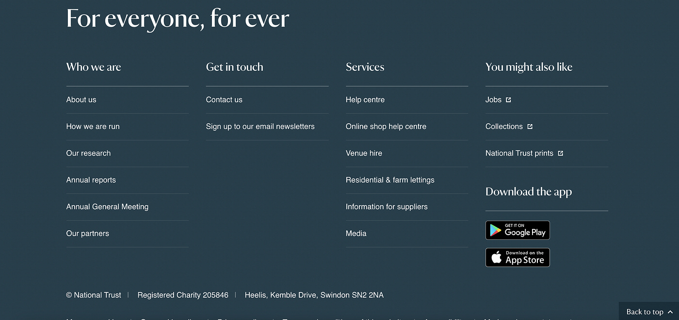
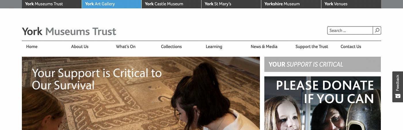
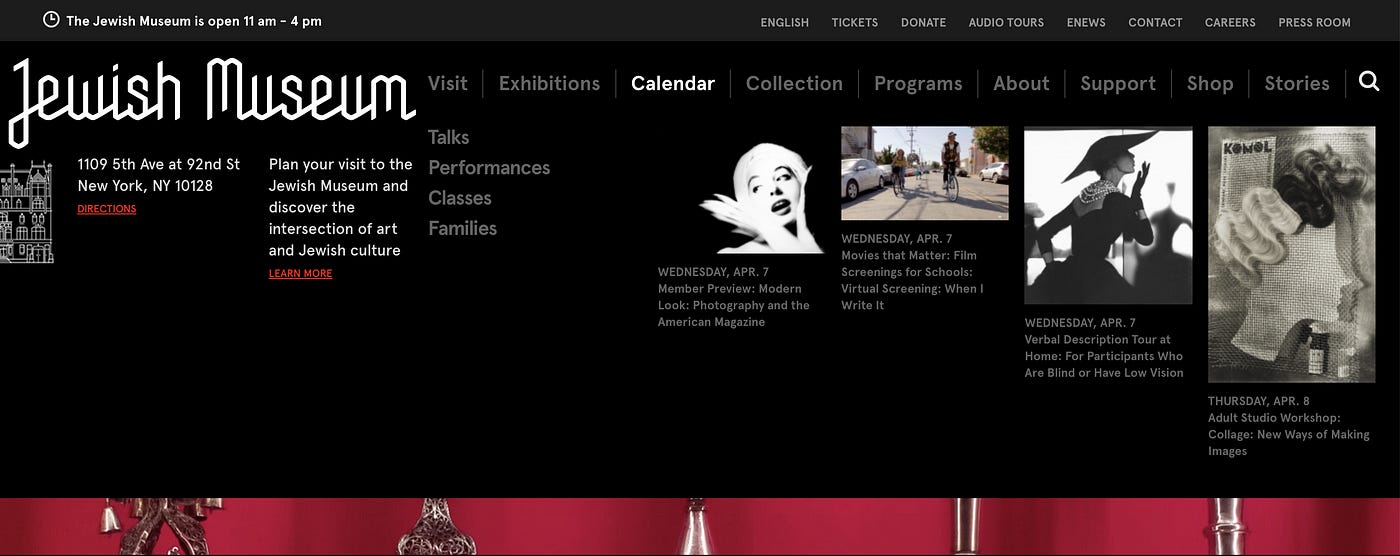
Footers typically become a catch-all for content that doesn’t fit neatly anywhere else, or content likely to be searched from Google (press, contact details). We often see users in usability testing browsing to the bottom of a page if they haven’t been able to find content in the nav or site search. The National Trust have also linked to their microsites here, pages that won’t necessarily turn up in your site search. The other feature that’s often in the footer — although not pictured here — is the site newsletter.
3 – Writing web content content
This section describes the tools and processes you can put in place to keep content consistent as it is being developed. I’ll talk about 3 things I’ve used in the past that have proved helpful:
A digital style guide.
A content manual for planning page content.
Digital knowledge staff training sessions.
3.1 – Digital style guide
The purpose of the Style Guide is to keep editorial consistency when writing text. I generally compile these from 4 main sources.
You may already have a style guide that’s particular for print, this is a good starting point for lifting organisational-specific conventions around capitalisation. But it shouldn’t be adopted wholesale as some things that work fine for print (for example the use of italics and ampersands) are not good practice on web.
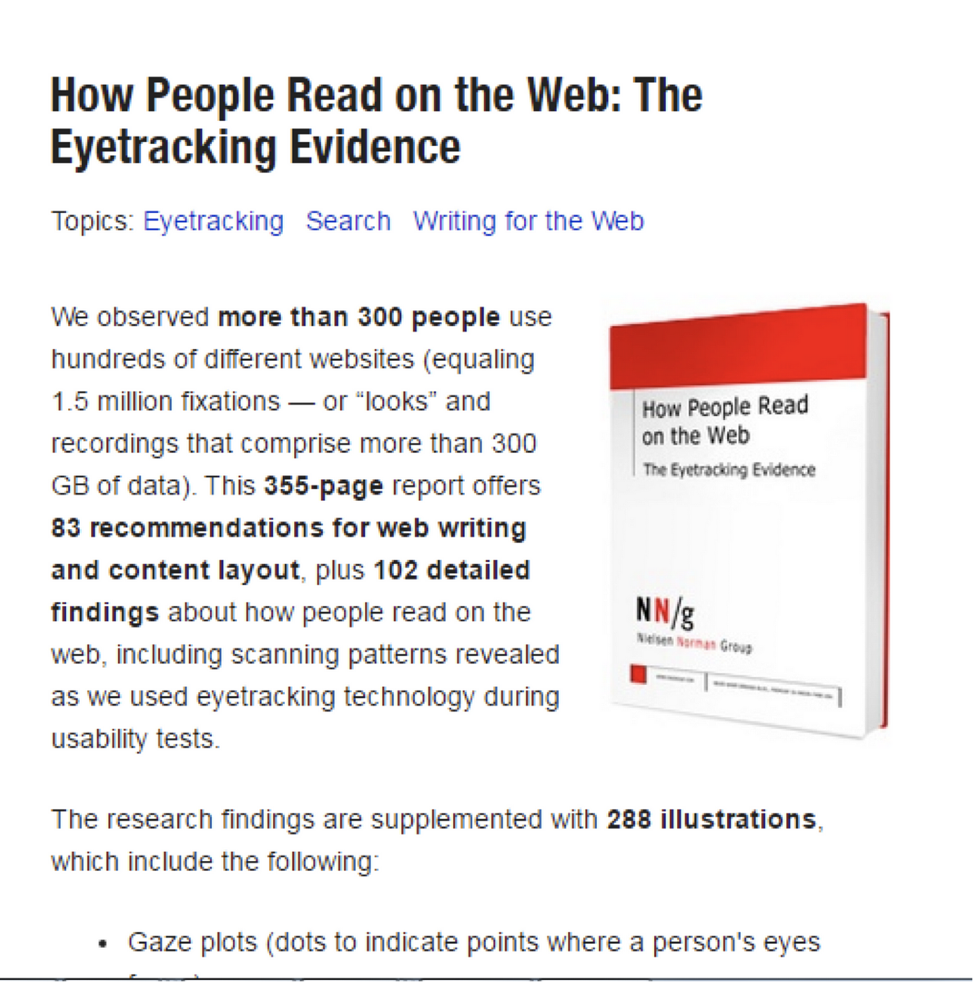
The last word in credible research into best practices for writing for web is from the Nielsen Norman Group. If you just read one of their publications I’d recommend How People Read the Web (full paid report available here). This takes you through the data and findings from which we derive writing for web best practices around formatting and chunking text so that it can be more easily read online.
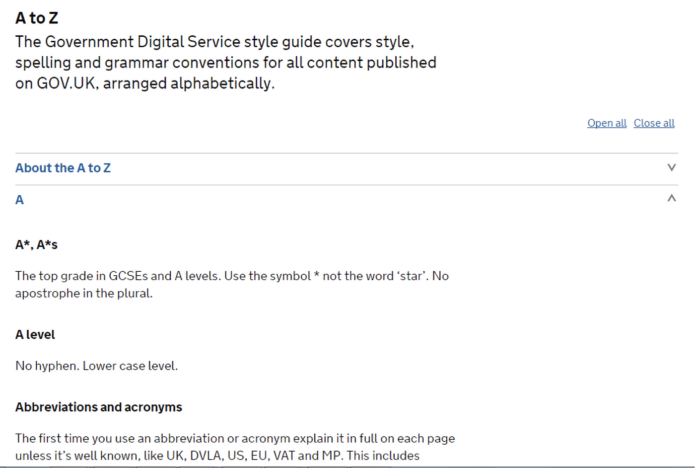
The Government Digital Service’s A-Z style guide has appropriated a lot of this research. Some of their content is specific to government departments (e.g. here A levels and ampersands, but others — like ‘abbreviations’ are useful elements to fix on your own style guides).

I’ve also tended to add in organisational specific vision/values/tone of voice principles so that this style guide feels particular to the organisation and informed by agreed communications priorities.
These four inputs should help guide you to create your own A-Z style guide and allow you to create consistent web pages that conform to best practice for writing for web. Consistency here also helps reduce cognitive load for your users as they learn how to efficiently browse pages on your site by recognising similar page structures and information modules.
3.2 – Content manuals
Stakeholders can get much more nervous when you start suggesting new words. So how do you get around that?
In my experience the biggest criterion of success is trust, how much do key stakeholder trust you with their content? Do they feel informed and like you’re moving them in a coherent and positive direction? Much of this will depend on how successful your advocacy has been throughout the earlier phases of the project.
To help smooth the process along, and create a structure for collaborating with info owners / subject matter experts, I developed a content manual. The content manual works on a page-by-page basis. It amalgamates:
Findings from the research pertinent to this page
Where this particular page existed in the site navigation and expected user behaviour to reach it
Metadata fields such as the URL, meta description, template type, how it is being migrated and what checks need to be done before content design can be advanced.
Each page will have defined user needs and acceptance criteria to meet to be deemed a success.
I then assign the information this page needs to provide in a relative priority order
Then I visually screenshot what each module will look like and suggested text of approximately the right length.
I then allowed the stakeholder to modify this text around the same character limit
All this gives stakeholders an understanding of the aim and success criteria of the page and the visual design principles. It’s not that I’m writing the copy, but giving very clear, informed and specific guidance about the text, which allows the stakeholders to meaningfully input but in the context of a strict structure and coherent design principles. To my knowledge, this content manual approach is new, I haven’t seen anything similar. I wrote about it on Sarah Richard’s blog in 2019, based on work I did from 2016-18.
The format of these manuals varies a lot depending on the stakeholders. That’s part of the art of content strategy. In my expereince commercial tend to want more rationalisation that’s heavier on pictures and KPIs, and curators wanted more context, research and words. The art of this is judging the appropriate sign-off format to allow people to input meaningfully and understand the rationale and principles behind the structure you’ve created.
3.3 – Digital Knowledge staff training sessions
This programme of sessions has helped me create buy-in and organisational understanding in parallel with the new web build. By covering topics like how to use Google Analytics, writing for web and Search Engine Optimisation, I’ve been able to skill up staff in different areas of the organisation in the skills and knowledge they’d need in order the edit existing pages and create new ones whilst keeping to the principles of web best practice and within the overarching strategy the site had originally been built with.
Further reading
If you’re about to undertake a major web content project, I’d recommend the following books as sector-leading in providing an overview of best practices and thinking in the field.

How People Read on the Web from the Nielsen Norman Group; this is mentioned above, it’s the best research I’ve found that has looked forensically at how people scan webpages and isolated how that’s different to print, and what that means for a web content writer. There’s a free summary here, but if your institution’s happy to pay for the full paid report, there’s more detail in there.
Content Strategy for the Web by Kristina Halvorson; this is just a really sensible, step-by-step guide covering a lot of the same ground I’ve outlined here. A good ‘how to’ manual to have to hand before undertaking your first big web content project. She does have much larger websites in mind, so you’ll need to be sensible about how many of the steps she’s outlined it makes sense for you to follow.
Content Design by Sarah Richards. Sarah Richards (now Sarah Winter), was at the helm as Head of Content at Government Digital Service at the time they were building for first version of gov.uk, defining the standards of things like the A-Z style guide and how to employ agile project processes to large web content. She created the term ‘content design’ which has since generated great swathes of employment in the form of ‘content designers’. It’s a great, pithy read.
The Content Strategy Toolkit by Meghan Casy. This book also includes around 28 downloadable templates, tools and visualisations taking you through different parts of a web transformation project. As with Halvorson/Rach it’s really geared towards much larger web builds so a lot of the advice /steps in the process you can take with a pinch of salt. But great as a reference point for specific parts of the process / sense checking your deliverables in a given area.
So long, farewell.
Finally, best of luck! If you have questions, feel you want additional help or advice, please do get in touch: georgina@onefurther.com.