


How to get sign off for your web content
Presenting the content manual

👋
To make effective change, to get people on your side, you need to explain your thinking.
To get buy-in for changes you want to make to web content, it's not enough to present stakeholders with 'fait accompli'. You've got to take these people on a journey with you. And not get their backs up too much by pointing out everything that's wrong with how they had it.
Think about it. When you’re trying to get sign-off of a draft webpage, your draft will differ from a live webpage. Unlike a webpage, with an offline file you have no sense of:
Where in the navigation this page exists – the context in which someone might navigate to it
How a user typically gets there – are people mainly landing on this from search (and not via the navigation)?
Whether the majority of people are viewing this page on a much smaller screen size
To get effective input from stakeholders and subject matter specialists, you have to give them this context.
How best to do this?
I've created what I call a 'content manual'. It's not rocket science. It's basically a document that gives stakeholders that missing context.
Based on how common a scenario getting sign-off on new webpages is, I’m surprised I’ve not seen more examples of it. I see a lot of pixel-perfect design files of new proposed webpages. But this doesn't help a stakeholder understand what's changed, and crucially; why.
The whole point of content design is to use user research to inform data-informed design. We should have a better, more transparent way of presenting this back to those who haven’t been part of the content design process. And allowing them to meaningfully input within set parameters. Here’s my way.

Content manual: template
Outline the aim of the document
Start your content manual by outlining what the aim of the document is. You’ve never heard of it before so the stakeholder you’re presenting it to will not have done either.
The aim of the document is three-fold. It should:
Outline the context in which audiences land on this page
Is it mainly from search, from campaigns, or from within the site navigation?
Where does the page live in the site information architecture, what’s the logical hierarchy?
State what the intended purpose and audience is for the page
What do you know from user research and testing that these audiences need from it?
Define the user needs and acceptance criteria to meet to be deemed a success.
Translate all the above into a suggested design and copy; presenting the information users need in an effective way
Let’s look at all of those in more depth…
Outline the purpose and requirements for the new page
Here’s an example of what I might use for a Plan Your Visit page. It’s the conceptual context stakeholders need to know about what you’ve found out that this page needs to do to be a success.
High-level purpose: this is likely to be the most popular page on the site (after the homepage). It should function like your online storefront to all potential visitors. It should be easy for potential visitors to find the information they need, and at the same time, it should inspire a broad range of visitors to come to the space.
AIMS:
Allow potential new visitors to feel comfortable and inspired to visit the place
Give new visitors the information they need to know what to expect about visiting [[Museum]]
Allow returning visitors to check up on details that might have changed since their last visit (such as the gallery map)
Allow users with additional needs to find the information they’re looking for
Target audience: All [[Museum’s]] actual and potential visiting audience
Tone: Welcoming, clear and inclusive. The purpose of this page is not just to inform but also to engage and inspire confidence in audiences, including new audiences and those with additional needs.
Requirements:
It must be easy for a new user to scan quickly
It must be easy for existing users to quickly navigate to details relevant to them
Imagery and tone should feel inclusive and inspire confidence
Facts should be relayed logically and clearly, leaving no room for misinterpretation
Visuals and tone should reflect the warmth of the organisation’s ethos, and also highlight how visitors can get the most out of their visit: what they can see
It should point visitors to maps and guides that allow new potential visitors to conceptualise the kind of experience they will have, and how to plan their trip
Screenshot the modules of the page, rationale and suggested text
This is going to look different depending on what page you’re looking at, how many modules your CMS has to play with and what your content design wireframing tools are.
But let’s imagine we’re working with our fictional Plan Your Visit page. You can follow a similar presentation format, with annotated rationale, to what I used on these content design templates:


For plan your visit, you might have components for:
Header banner
Opening times
Directions and parking
Access
What’s here
During your visit
For each of these, you're going to want to create a subheading in your manual, screenshot what the module looks like and any text you might suggest. You’ll also want to explain the rationale for the module’s placement and content.
Here’s an example below (with rationale for each section in italics):
Module 1 – Heading banner

This is the only module that will be above the fold on all screen sizes. We know from our user testing that the main reason people are on this page is for opening hours. We need to present that information high up to answer that need. We also want to inspire people to feel welcome and included here, and we can do that through using inclusive, warm images and language.
I’m less concerned in this post about what the rationale for each module is, but more about the presentation format. You’re inviting stakeholders who haven’t been part of the process to engage with your content. So you need a way to present to them what data and insight you have that has led you to the design you’re proposing.
Module 2 – Welcome statement
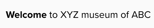
A short welcome that briefly articulates who you are and what you’re known for. People may not know this, and they quite possibly won’t know as much as you about why you’re worth visiting. Distil this here into a single sentence to keep people reading.
Module 3 – Opening hours

Most people want to know when we are open on a weekly basis. We found a small number of international visitors and groups that want to plan in advance around the holiday season. This content is provided on a separate page but linked to here.
Module 4 – Directions and parking

We know that users take in geographic/spatial information more readily from diagrams than from text. In this image, we’re showing where the nearest parking spaces are.
The accordions on the right-hand side open and close when clicked and provide more detailed links and itineraries for how to get to us depending on how you’re travelling.
and so on…
In this piece, I’m not presenting you with a method of what a template content design for a Plan Your Visit page looks like. I’m showing you my method of presenting a sign-off document to stakeholders that takes them through discovery, the context of where the page exists on the site, and how it will be accessed online.
I’ve found this method useful for taking stakeholders along the process with me and finding ways to collaborate with them usefully and within a set framework. That keeps content design decisions in the digital team but allows inflexion points with subject matter experts. So our content can be informed and within a robust design structure and best practice for web.
💁♀️
Feeling ready? Go get ‘em.
Feeling not quite so ready? Give me an email; georgina@onefurther.com.
How I can help
I’m literally writing the book on Digital Content in the cultural sector. Here’s two things people often get in touch with:
Help me apply content design to my website – ‘We’ve got a lot of legacy content. We want to implement a process that assesses our current content and makes a plan for re-envisaging priority sections in a user-focussed, best practice way’.
Help me get some clarity on how to do multi-channel storytelling more effectively – ‘Everyone’s got an opinion on what we should be doing on social/blog/video, so it feels it’s impossible to keep staff across the organisation happy. Meanwhile having those internal conversations gives us less headspace for understanding what our audiences might want, where our future audiences are – and mobilising a collective plan to meet them there. Help!’
This is super helpful, thank you!!